There has been an enormous shift in the way people shop once they’re inside the store. It’s all about clearing obstacles for the customer. Recent research shows that easing shopper frustration is the most promising path to higher sales. That’s why Walmart is replacing its 15-foot-high shelves with lower-profile displays, to give shoppers a clear view of the entire store. At the same time, successful chains such as Walgreens are reducing SKUs to make it easier for shoppers to find the top-selling items.
In the new stores we design, you’ll see “emotive” signs near the entrances, which welcome customers and provide a comfortable atmosphere. Directional signs are also placed at every entrance, because today’s shoppers are almost always mission-focused. Their goal is to find a desired item quickly. The feedback I get from retailers who have installed new signage is that consumers are happier when they are self-directed and don’t have to spend time searching or asking for assistance.
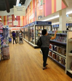
Contrast this approach with the practice of just a few years ago when retailers deliberately tried to keep customers in a store for as long as possible. For example, many grocery stores still put top sellers such as milk as far from the check-out area as possible, which forces shoppers to walk past other temptations. It’s a practice that endures in supermarkets, even as competitors like Dollar General and CVS capture ever-increasing revenue from food products— including milk—by giving time-starved shoppers a faster, more convenient alternative, with dairy cases near the front of the store.
Shoppers who strolled through a mall in an earlier era now want to be directed to the entrance of the store at which they plan to shop. Much of my work these days is focused on developing new, separate entrances for large furniture stores to highlight key departments for mission-focused shoppers. In many cases, for example, large furniture retailers are setting up stand-alone buildings to sell mattresses, just as Internet retailers offer standalone specialty stores to demonstrate expertise in a product line and provide a one-stop solution to consumers.
In brick-and-mortar stores, technology is making it far easier and less expensive for retailers to convey a more cohesive set of messages inside the store. Now there are large-format message panels that can be hung from a store ceiling to help define a display area, without the need to build walls. Large-panel frames, extending up to 10 feet by 8 feet, can either display a message or serve as an architectural backdrop, with images of windows or doors. These fabric panels are inexpensive and can be moved or updated with new messages quickly, which makes it easy to provide a new look to a specific department or the entire store.
Once a shopper’s immediate need is met, they’ll often scan the store for other interests, such as children’s furniture or sofas. Clear signage helps shoppers discover and be inspired by other products. This process of self-discovery and inspiration is far more effective than having the customer receive suggestions from store associates.
It’s clear that the shopping experience can be improved with signage created to ease shopper confusion. In many cases, we find that furniture retailers are barely aware of just how many signs have been added to their stores or the conflicting signals that are sent by separate retailer and manufacturer messages.
A comprehensive signage makeover inside a store is not a major expense. It makes shoppers much more comfortable by reflecting the Internet’s drill-down shopping process, which has become deeply ingrained and is preferred by many consumers, particularly younger ones.